184 search results
(0.055 seconds)
- JP2 by Linotype,
$40.99JP2 has some special roots being inspired by the actual handwriting of Pope John Paul II. Franciszek Otto took this source material and transformed it into a high quality font. The result is a rough, but intelligent, design with letters that slightly bounce along the baseline to mimic typical writing. Their short x-height, long extenders, and unique capital letters make this a very beautiful and distinctive typeface. Try it out for greetings, invitations, or posters! - Jagged BRK - Unknown license

- Jagged (BRK) - Unknown license

- TPG SquareSpace by Tolstrup Pryds Graphics,
$15.00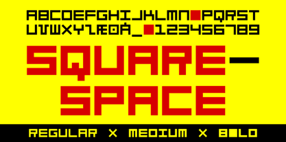
- TPG FaceFont by Tolstrup Pryds Graphics,
$15.00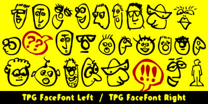
- TPG Katalog by Tolstrup Pryds Graphics,
$15.00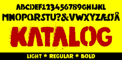
- TPG DontBlurry by Tolstrup Pryds Graphics,
$15.00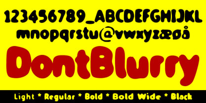
- TPG PrydsPensel by Tolstrup Pryds Graphics,
$15.00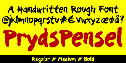
- TPG Tolle One by Tolstrup Pryds Graphics,
$15.00 TolleOne - a display font family of five weights, named after my wife, whose nickname is Tolle. The “One” indicates that she is number one, of course, but also that this is the first set of fonts I have published.
 - Knew Font Jagged by Ingrimayne Type,
$9.00 KnewFontRagged is a distorted version of KnewFont.
 - JP Hand - 100% free

- JP Alva by jpFonts,
$19.99 jpAlva is a technical and functional sans-serif that consists of 40 typefaces, divided in 2 font families jpAlva and jpAlva Extended. A universal family of typefaces that fits pretty much any purpose. It illustrates a precise balance of modern geometrics, with a functional yet sparing style that effectively communicates without distraction. A straightforward, unadorned appearance with efficient construction. Simple, clean with a technical note and a wide range of styles it is perfectly suitable for a wide range of applications, from identity systems to editorial design, from signage systems to software applications. Designed with powerful OpenType features (e.g. figure sets, fractions, ligatures, case sensitive forms) and extended language support, it is easy and enjoyable to use.
 - JP MultiColour by jpFonts,
$29.90 Multicolored Fonts Many years ago, when Xerox Corporation still had its own font department, I came to Los Angeles in 1985 to train the IKARUS program. One day Bill Kienzel, head of the Xerox font department at the time, said we should go to the Hollywood Hills together; he knew people there who were experimenting with multicolored fonts. After a little wandering through the winding streets of the many hills, we reached a somewhat overgrown, simple family house standing under trees. A group of very inspired designers were waiting for us there. They immediately showed us the works they created using photomechanical tricks. They were fascinating. The American colors and the whole look seemed noble and enchanting. The problem was that this process was very difficult to implement and required a lot of effort on individual letters. They dreamed of a colored font that could be used for normal typesetting. We thought back and forth about how to save the individually colored letters in a common font, but soon gave up because we didn't see a technical option. So this idea and the memory of the time in Hollywood lay dormant in the back of my mind for many years, until at the beginning of this year 2023 I received an order to produce an outline typeface and the story came back to me. Suddenly I knew how to solve the problem from back then: if only the areas that should have the same color in all letters were saved in their own separate fonts, they could be colored independently of each other and later placed on top of each other. I implemented this in the 5 fonts that are now available with the 3 variants “Outside”, “Middle” and “Inside”. Together with the background, 4 colors can be combined with each other. This method works in text programs such as Word or InDesign. In Photoshop or Illustrator, the individual surfaces can also be colored by converting them into paths if the additional “Complete” variants (which contain all 3 contours) are used. There is also a “Basic” variant that can be used to achieve special effects such as overlay, bleed, etc. The first 5 fonts in this series are all based on the principle of contouring. Anyone who claims that you don't need any special fonts because they can be created automatically from any font using common programs is wrong or is only telling only half the truth. Anyone who has ever dealt with this knows that many individual adjustments to the design are necessary after contouring. This has happened in the 5 fonts that are now available and have very different styles. The dream from back then has come true. The user can set any text, long or short, in multiple colors, freely design the color scheme and apply all the usual typographic settings. Volker Schnebel, November 2023
 - Pulse JP by jpFonts,
$19.95 Pulse JP is a constructivist text and display font that differs from comparable fonts due to its special sharpness and harmonious balance. Its technical and constructed form creates a somewhat artificial impression of special appeal. It is ideal for display on the screen and is used in many projects. Pulse JP is a super family consisting of 48 weights from compressed to expanded in 6 fat gradations each. This opens up a wide range of designs and the possibility of combining typefaces of the same character in a wide variety of variants, or of being able to adapt typefaces to very different conditions. The details of the individual typefaces are coordinated with each other with great precision and perfectly implemented in terms of craftsmanship. In all variants, this leads to a well-balanced typeface with particular sharpness. The very extensive character set supports 120 Latin languages. Pulse JP meets the pulse of the times, which is in a transition away from the humanistic to the classicistic designs. jp Pulse outperforms many other fonts not only in terms of sharpness but also in terms of variety and is therefore always a good choice.
 - PG Gothique by Paulo Goode,
$30.00 This is my addition to a long line of traditional gothic typefaces. As you can probably tell, PG Gothique is inspired by classics such as Trade Gothic, News Gothic, Franklin Gothic, Alternate Gothic, and Gothic Gothic. Well, maybe not the last one... But Paulo, we have all those already, why would we want to add PG Gothique to our collection? This typeface has many subtle design nuances that differentiates itself from its historical influences. Also, this is possibly the most comprehensive Latin gothic font family released to date. It has 99 fonts that cover pretty much every style you could ever need, and if you do require more, this family is available as a single variable font that covers all the weights and widths in between. PG Gothique is designed to handle a multitude of applications, from branding projects, to titles, body text, user interfaces, and film poster credits. This type family has a style that will suit the purpose. There are 99 fonts in this family, ranging from Thin to Ultra weights across six widths in both roman and italic*. Activate Stylistic Set 1 and you will get the alternate slab serif-style capital “I” that offers improved legibility when placed adjacent to a lowercase “l”. PG Gothique has an extensive character set that covers every Latin European language. If you would prefer PG Gothique as a single variable font, please choose PG Gothique Variable. Test drive PG Gothique today – both the Regular and Italic fonts are offered as a free download. See full details and hi-res examples at https://paulogoode.com/pg-gothique Key features: 9 Weights 6 Widths 99 Fonts Small Caps Old Style Figures European Language Support (Latin) 600+ Glyphs per font *Compressed weights do not include italics.
 - PG Grotesque by Paulo Goode,
$30.00 This is my interpretation of Edel Grotesk – a “lost typeface” from circa 1914 produced by Johannes Wagner GmbH of Ingolstadt, Germany. PG Grotesque is definitely not a revival, or even a faithful reproduction of that typeface as I was unable to source enough accurate references. What I have done is take the essence and unique characteristics of that typeface and brought this forgotten gem right into the 21st century. The full family features 99 fonts spread across 9 weights and 6 widths. PG Grotesque is also available as a single variable font so that you can fine tune the width, weight, and italic angle to your exact preference. Distinctive features include high-waisted capitals, a straight-legged capital ‘R’, and flattened arches in the ‘a’ and ‘g’ glyphs. Using PG Grotesque will give your typography a distinctly retro feel with its vintage heritage inherent in every character. You will find this is an incredibly versatile typeface with added value from its extensive language coverage along with small caps availability at the click of a button. PG Grotesque will prove to be a valuable asset in your type arsenal. Test drive PG Grotesque today – both the Regular and Italic fonts are offered as a free download. See full details and hi-res images at https://paulogoode.com/pg-grotesque Key features: 9 Weights 6 Widths 99 Fonts Small Caps Old Style Figures European Language Support (Latin) 550+ Glyphs per font
 - PG Grotesque Variable by Paulo Goode,
$300.00 IMPORTANT: This is the VARIABLE VERSION of PG GROTESQUE This is my interpretation of Edel Grotesk – a “lost typeface” from circa 1914 produced by Johannes Wagner GmbH of Ingolstadt, Germany. PG Grotesque is definitely not a revival, or even a faithful reproduction of that typeface as I was unable to source enough accurate references. What I have done is take the essence and unique characteristics of that typeface and brought this forgotten gem right into the 21st century. This variable version includes 99 instances spread across 9 weights and 6 widths with the ability fine tune the width, weight, and italic angle to your exact preference. Distinctive features include high-waisted capitals, a straight-legged capital ‘R’, and flattened arches in the ‘a’ and ‘g’ glyphs. Using PG Grotesque will give your typography a distinctly retro feel with its vintage heritage inherent in every character. You will find this is an incredibly versatile typeface with added value from its extensive language coverage along with small caps availability at the click of a button. PG Grotesque will prove to be a valuable asset in your type arsenal. See full details and hi-res images at https://paulogoode.com/pg-grotesque
 - JP Alva Expanded by jpFonts,
$19.95 jpAlva is a technical and functional sans-serif that consists of 40 typefaces, divided in 2 font families jpAlva and jpAlva Extended. A universal family of typefaces that fits pretty much any purpose. It illustrates a precise balance of modern geometrics, with a functional yet sparing style that effectively communicates without distraction. A straightforward, unadorned appearance with efficient construction. Simple, clean with a technical note and a wide range of styles it is perfectly suitable for a wide range of applications, from identity systems to editorial design, from signage systems to software applications. Designed with powerful OpenType features (e.g. figure sets, fractions, ligatures, case sensitive forms) and extended language support, it is easy and enjoyable to use.
 - Pulse JP Arabic by jpFonts,
$29.95 النبض - the Pulse Pulse JP ME is a constructivist text and display font that differs from comparable fonts due to its special sharpness and harmonious balance. Its technical and constructed form creates a somewhat artificial impression of particular appeal. It is ideal for display on the screen and can be used in many projects. Pulse JP ME is a super family consisting of 48 fonts from compressed to expanded in six weights each. This opens up a wide designspace with the possibility of combining typefaces of the same character in a wide variety of variants and being able to adapt them to very different conditions. The details of the individual fonts are coordinated with each other with great precision and perfectly implemented in terms of craftsmanship. In all variants, this leads to a very balanced design with particular sharpness. The very extensive character set supports 120 Latin + 7 Arabic languages + Hebrew. The Arabic characters were designed in close collaboration with the Iranian designer Prof. Raafat Negarandeh. Here the constructivist approach is repeated within Arabic proportions. This leads to a very reduced and clear design with high legibility. Additional typographical adjustments can be made in the variable font, which is also available. There all variants are stored in a single font and can be continuously fine-tuned between them.
 - PG Gothique Variable by Paulo Goode,
$300.00 IMPORTANT: This is the VARIABLE VERSION of PG Gothique This is my addition to a long line of traditional gothic typefaces. As you can probably tell, PG Gothique Variable is inspired by classics such as Trade Gothic, News Gothic, Franklin Gothic, Alternate Gothic, and Gothic Gothic. Well, maybe not the last one... But Paulo, we have all those already, why would we want to add PG Gothique Variable to our collection? This typeface has many subtle design nuances that differentiates itself from its historical influences. Also, this is possibly the most comprehensive Latin gothic font family released to date. It has 99 default styles that cover pretty much every width and weight you could ever need, while this variable version unlocks options to match your exact style preference – including the angle of italic. PG Gothique Variable is designed to handle a multitude of applications, from branding projects, to titles, body text, user interfaces, and film poster credits. This typeface has a style that will suit the purpose. There are 99 default instances in this family, ranging from Thin to Ultra weights across six widths in both roman and italic. Activate Stylistic Set 1 and you will get the alternate slab-serif-style capital “I” that offers improved legibility when placed adjacent to a lowercase “l”. PG Gothique Variable has an extensive character set that covers every Latin European language. See full details and hi-res examples at https://paulogoode.com/pg-gothique
 - Modern MT for Dior JP by Monotype,
$29.99Cut by Monotype between 1900 and 1902, the Monotype Modern font family was based on Miller & Richards News 23 and 28; slightly condensed news text types of the 1890s. Monotype Modern is a lively typeface, with long, fine hairlines and well rounded letterforms, representing the best of nineteenth century modern face design. A classic text face, and typical of the moderns that were produced in the United Kingdom at that time, being less extreme in its rendering than some of the models of purer form being produced elsewhere. Monotype Modern is an excellent text face for magazines, newspapers and books, the heavier and more condensed versions are useful in headlines and display. - It Lives In The Swamp (BRK) - 100% free

- Electrofied - 100% free

- Janda Amazing Grace by Kimberly Geswein,
$5.00 Hand-drawn lettering to add authentic calligraphy style to your work. Rough, jagged edges for realistic ink-bleed.
 - Schwarz by Miguel Ibarra Design,
$20.00 Schwarz is a Black Letter typeface inspired by all that is black. Jagged edges and sharp diagonals make Schwarz a head banging font. Some stylistic alternates and ligatures are also available.
 - Erosion JNL by Jeff Levine,
$29.00 Take a classic sans serif typeface, run it through a filter for a "wind" effect then auto-trace the design. The result: a broken, jagged and rough type font called Erosion JNL.
 - Winnetka JNL by Jeff Levine,
$29.00Winnetka JNL was inspired by Cooley Antique Tuscan Condensed - a printer's wood type manufactured in 1859 by J.G. Cooley. Given an additional hand-made treatment, the lettering resembles characters made from cut paper. - Dungarees by Victory Type,
$-Dungarees is a font on caffeine... It's a normal sans-serif typeface gone wild: jagged in some places, smooth in others. It makes documents not only fun to read but really interesting too! - Alphabit by Ben Buysse,
$19.99 Alphabit is a grid-based bitmap typeface that celebrates the blocky and jagged letterforms of early digital typography. Designed with technology as the central theme, it simultaneously references a bygone era of computing and yet feels relevant for modern applications.
 - Risus LCB Dingbats - Unknown license

- Ghost Festival by Yoga Letter,
$14.00 "Ghost Festival" is a special Halloween font. This font has a jagged character and is perfect for Halloween. It is very easy to use because it has been specially designed. This font is equipped with uppercase, lowercase, numerals, punctuations, and multilingual support.
 - Argor Got Scaqh - 100% free

- Argor Man Scaqh - 100% free

- Argor Priht Scaqh - 100% free

- Alexy by aRc,
$10.00 Alexy is a hand-drawing of a twisted ribbon resembling a limited set of characters. Its unusual design makes it great as a headliner or it can be used for any ribbon awareness projects. Not suitable for signage use -- All lines are very jagged.
 - Crude Stencil JNL by Jeff Levine,
$29.00 Crude Stencil JNL is a rough auto-tracing of a vintage lettering stencil from the 1980s, with additional characters added in post-production. At small type sizes, the lettering takes on a "grunge" effect, but larger scale text will reveal more of a jagged "cut paper" look.
 - Ramones by Namistudio,
$15.00 Rebel, Energy, Punk, Power... Ramones, jagged interlock letter with bold line. This font will bring that IN YOUR FACE attitude in your design. No more soft side. It's all about the energy ! Either choosing the auto-generate interlocking letters, or keep it original, Ramones still brings you the power.
 - Brainoise by Ronny Studio,
$19.00 Punk-looking fonts usually embody the rebellious and edgy spirit of the punk subculture. It is characterized by its bold, jagged, and distorted letterforms, which often feature exaggerated or irregular shapes. This font is perfect for your design needs such as: for posters, magazines, covers, brands, logotypes, band logos, etc
 - Vampire Bloods Drip by Sipanji21,
$12.50 Vampire Bloods is an incredibly unique horror display font with 2 style Font are Dripping and solid style with jagged Outline. Add this font to your favorite Halloween themed ideas and notice how it makes them come alive. Vampire Bloods is perfect for posters, packaging, banners, advertising, apparel, and more.
 - Bithead by Comicraft,
$19.00 INFO DUMP: Get jacked into cyberspace direct feed, no buffer with this hotwired font by John 'Son of a Glitch' Roshell. Initial upload to Ghost Rider 2099 was prematurely aborted, but not before the downramp pusbag Ozymandias pirated a jagged beta version and assaulted the Uncanny X-Men during 'Onslaught.'


Page 1 of 5Next page